
Volvo Kaffe
Working with the advertising agency GREY London, Volvo Kaffe was created around the Swedish concept of 'Fika'. A moment in the day to celebrate the every day over a coffee.
Service
Packaging, Creative
Client
GREY
Industry
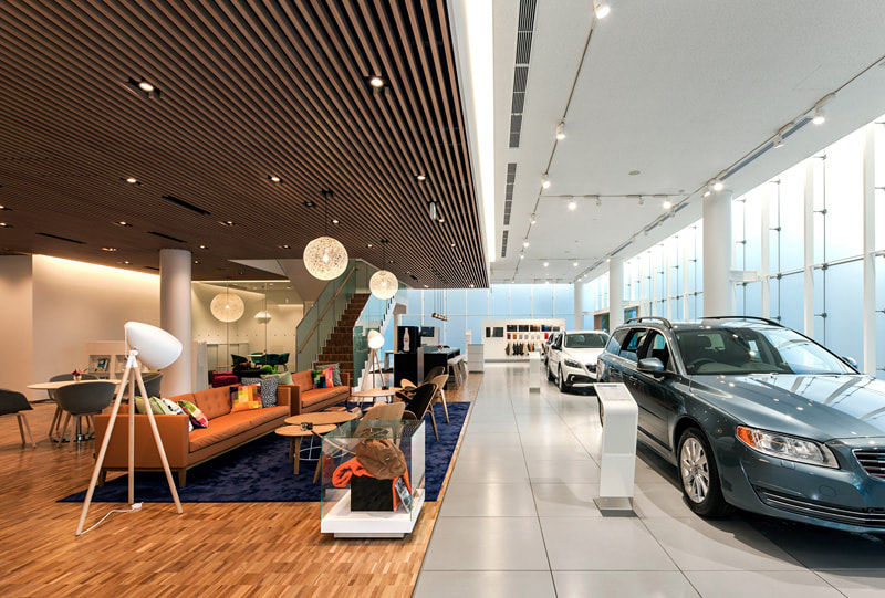
Retail
Year
2016
Brief
To develop a brand concept and identity for a coffee experience in Volvo's showrooms. Come up with a concept to build the brand around and develop visuals and packaging that met the design finesse of Volvo's brand values.
Response
Partnering with Swedish illustrator Sandberg, the packaging bought a whimsical feel that fully represented Swedish interiors. The logo was a simple word marque that worked in harmony with Volvo's brand, and wouldn't look out of place in the realm of established coffee branding.


Various graphical concepts were explored, originally with Swedish designer, Svenkst Tenn's artwork. A tasting notes card was included, as well as yellow and blue 'Swedish stitching' to seal the pouches.

A blue experience
Rather than position Volvo Kaffe within the over-done realm of 'craft' branding, I opted for a subtle confidence relying on their brand royal blue. The result meant it wouldn't look out of place next to the coffee giants such as Lavazza or Illy, who also rely on their country's brand awareness.


All in the details
Subtle nods were flourished throughout the packaging to reference Volvo's Swedish heritage. Much like the flag tabs you'll find on their car seats - the Nespresso pods packaging concealed a flag on the opening flap. The pouches sealed with two threads for a high-end finish.

"We had a really positive experience with Oliver, he worked quickly and efficiently, without compromising on quality."
- Alex Nixon, GREY (Volvo)