Pluto
Pluto is “travel insurance for people who don’t like insurance”. An online product targeting millennials that aims to demystify the stuffy preconception of travel insurance.
Service
Brand, Print & Digital
Client
Pluto
Industry
Insurance
Year
2019
Brief
Design an innovative brand system that shook up the conservative feeling of insurance. One that could get a younger audience on board that typically shunned the idea of travel insurance.
Response
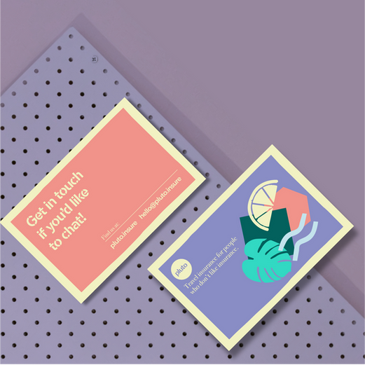
A fully developed brand identity and tool kit that is progressive but not obnoxious, smart but not geeky. Fun but not childish and puts their love of travel at the heart of everything they do.

The brand aesthetic was inspired by classic Jazz posters of the 1950/60's that used vibrant colours and whimsical graphics to advertise to a broad audience. Notably artists like Paul Rand and Reid Miles in the US, and Raymond Savignac in France. The stencil typeface also added to the whole brand look and feel, differentiating the company from competitors.
A brand that lives beyond digital
The brand had to feel unified across all areas of advertising, whether digital or in print. Bold vivid Pantone colours meant the brand felt alive and 'digital-first' even out of home. A full suite of icons that evoked feelings of travel and adventure allowed the brand to be flexible and creative in any of its applications.


"It was a joy working on this project with Oliver. I was hugely impressed with how he took a challenging brief and his interpretation of our positioning, philosophy and personality and quickly crafted something we instantly fell in love with. He did a great job finding the balance between interpreting our demands and guiding us with his creative expertise and experience. The result is a brand that everyone who's seen has loved."
- Harry Williams, Pluto Insurance


